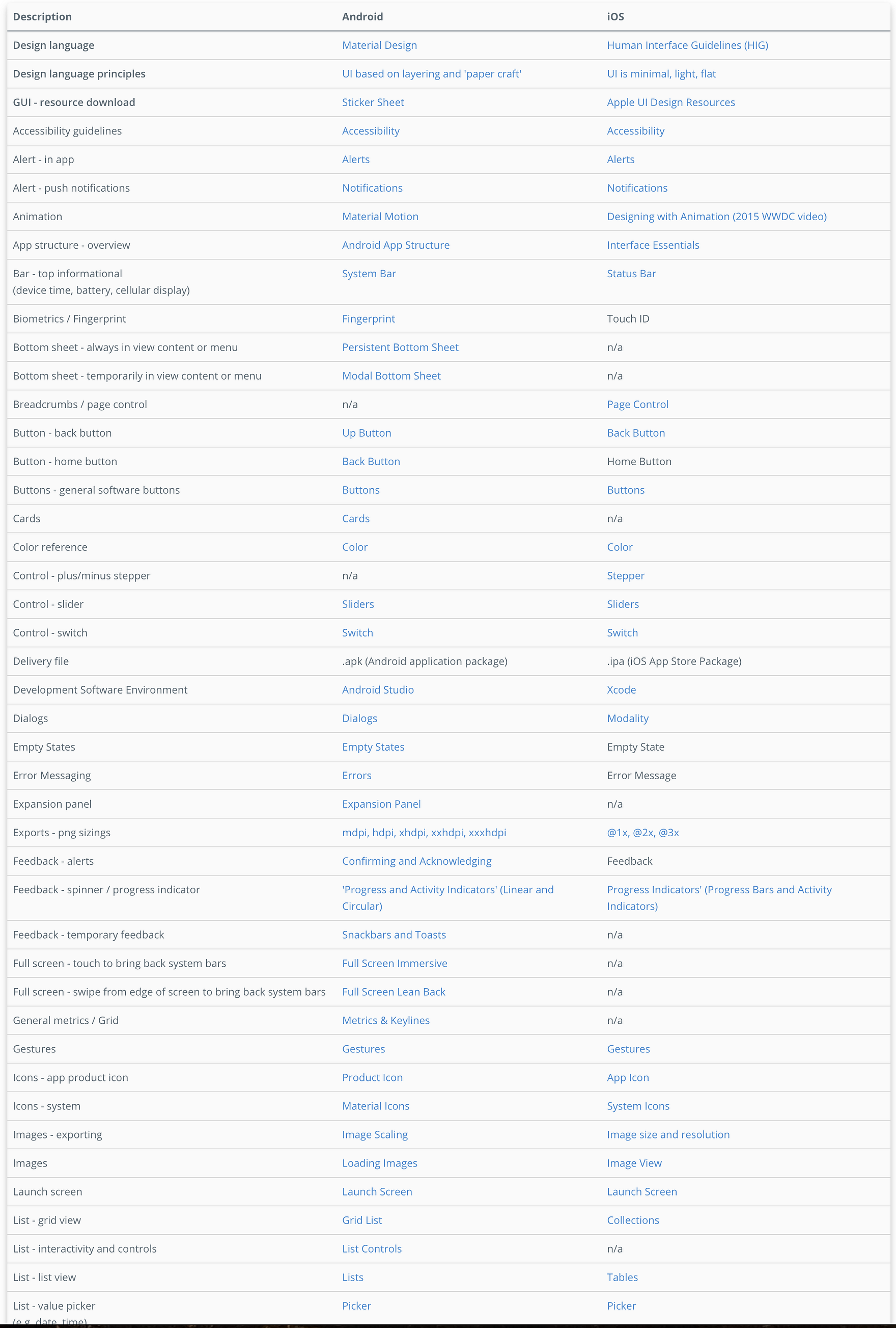
As a mobile product designer, keeping abreast of iOS Human Interface Guidelines and Android Material Design guidelines is part of my job. But between Android simple menus and dialogs, iOS form sheet modals and popovers, it’s sometimes hard to remember what is what, which is why I’ve found myself saying things like:
“Can we use the popover sheet menu thing that shoots up from the bottom?”
“Can we change the colour of the top bar? I mean the bar with the time and battery level?”
To help keep us all on the same page, and as a kind of penance to every engineer I’ve ever worked with, I’ve compiled a reference list of common Android and iOS native features, with links to the relevant Human Interface or Material Design guidelines.
It’s interesting to see how much effort Google has put into their design guidelines compared to Apple. Compare this information on text fields from Apple and Google.
Material Design’s reference is thoughtful, instructive, and full of useful images and gifs to help you understand the context, constraints, and recommended specs. Even Windows UWP has deeper guidelines than Apple’s, which are often thin on information and leave you scratching your head and searching other sources. One such source is this short but useful iOS reference from designer Ivo Mynttinen.
My iOS vs Android comparison list only links to official Apple or Google guidelines. This is because tech and design guidelines change so rapidly that today’s unofficial source could become tomorrow’s redundant information. The list itself starts with key reference guides at the top, with the rest ordered alphabetically.
I hope you find the list useful.

We’re ready to start the conversation however best suits you - on the phone at
+353 (0)1 833 7392 or by email